This tutorial will walk you through creating a button to swap back and forth between showing the full years worth of data, and showing all years filtered to the most recent date in your dataset. This can be useful when trying to see how the current year compares with prior years when not yet occurring dates aren't included.

The dataset I'll be using is the NICS firearms background checks. The data I use is extracted from the PDF's from BuzzFeedNews, I pivoted & cleaned the data up for use in Tableau which you can find here (filter for the state you want i'm using RI). Feel free to use your own, the import part is it had a [Date] (mm/dd/yyyy) field and a [Value] that we want to graph.
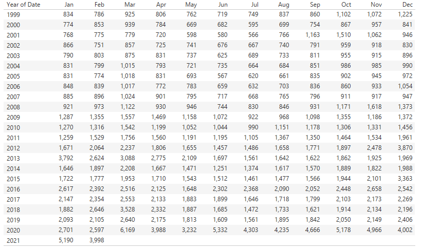
Simply dropping [Date] into columns and your [Value] into rows will cause a mismatch of time periods. As you can see from the image above, for 2021 we only have 2 months worth of data opposed to all prior years having 12 months. My goal for this dashboard was to highlight the massive increase that came with 2020, however I wanted to be able to also see if this trend was continuing into 2021 as well.
Step 1 - Create a parameter
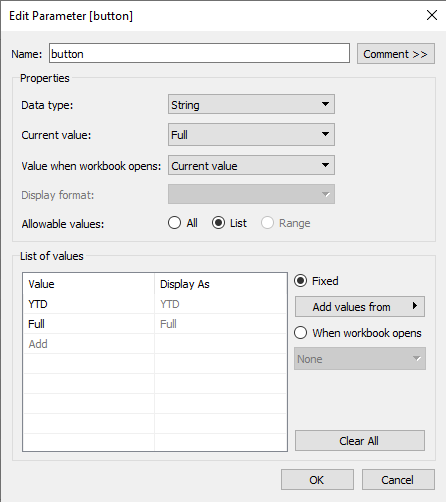
To start, create a parameter named "button" it will be a string parameter with 2 list values "Full" and "YTD". The default value will be "Full" which will show all data possible, 2020 will have 12 months and 2021 will have 2.
Step 2 - Create YTD Filter
// Named YTD Filter
if [button] = "YTD" THEN
if MAKEDATE(
    YEAR({MAX([Date])}),
    MONTH([Date]),
    DAY([Date])
) <= {MAX([Date])} then "show" end
ELSE "show"
END
This filter will be controlled by the button and toggled on/off. What this calculation does by using YEAR({MAX([Date])}) is move all years to match the year of your most recent date, then using <= {MAX([Date])} will filter to show all years up to the most recent date. So for our example data, will show all years only up to and including February, if we have data up to 2/18/2021 we would get all years data up to 2/18/{year}for each year.
Step 3 - Create Toggle Button
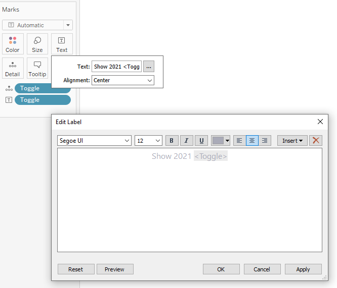
We need a working button, so go ahead and make a new sheet. We will need to create a new calculation to show the text of our button named "Toggle".
// named Toggle
IF [button] = "Full" THEN "YTD"
ELSE "Full" END
In this new sheet, pull in Toggle to details and text on the marks card, add any prefix you want or special formatting. Lastly add YTD Filter to the filters card and tick "show".
Step 4 - Create the Dashboard
Create a sheet, pull your [Date] to columns (should default to year), and your value to rows changing the marks to a bar graph. Pull your "YTD Filter" calculation to the Filters pane and tick "show".
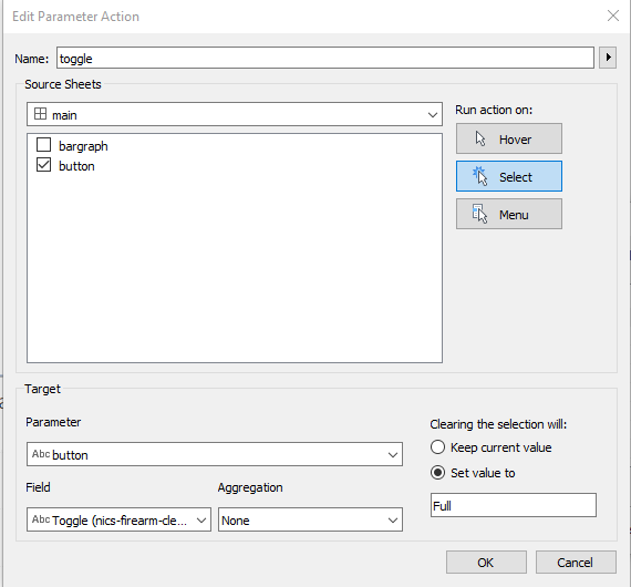
Create a dashboard, pull in your bar graph sheet, and your toggle button sheet. Go to Dashboard -> Action -> Add action -> Change parameter. Select your button sheet, action run on Select, the parameter is button and the field Toggle. You can choose 2 options for clearing the selection, "keep" will require 2 clicks for each toggle otherwise "set value to" "Full" will require only one click.