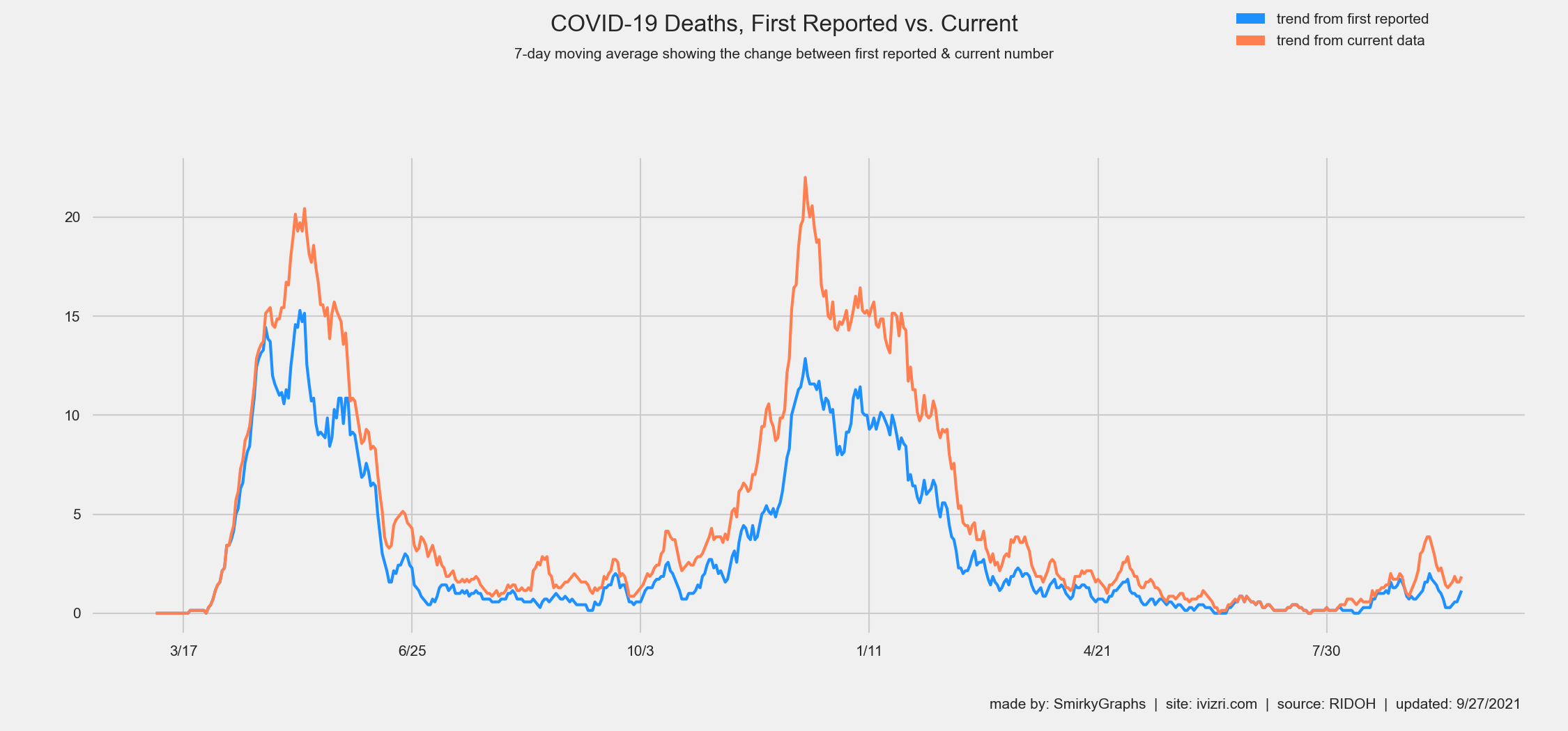
First Reported vs. Current (7-day Moving Avg)
This graph shows the 7-day moving average of the initial reported number of deaths by RIDOH for every date as a blue line labeled "first reported". In orange, you can see the updated 7-day moving average using current deaths for those dates labeled "current data". This provides an insight of the difference of preliminary data and more accurate numbers updated sometimes months later.
